Friday 13 December 2013

The common order of opening titles and credits in film

  • (NAME OF THE STUDIO)

  • (NAME OF THE PRODUCTION COMPANY)

  • (PRODUCER NAME) PRODUCTION or/and A FILM BY (DIRECTOR NAME)

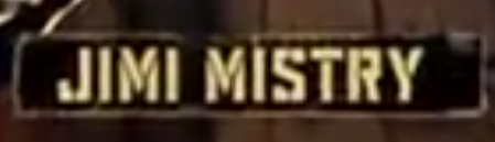
  • STARRING - principal actors

  • (FILM'S TITLE)

  • FEATURING - featured actors
  • CASTING or CASTING BY

  • MUSIC or MUSIC COMPOSED BY or ORIGINAL SCORE BY

  • PRODUCTION DESIGN or PRODUCTION DESIGNER

As a variation some of the below may be noted:
  • SET DESIGN
  • COSTUMES or COSTUMES BY or GOWNS 
  • HAIRDRESSER
  • MAKE-UP ARTIST
  • SOUND RECORDING 
  • VISUAL EFFECTS DIRECTOR or VISUAL EFFECTS BY
  • EDITOR or EDITED BY

  • DIRECTOR OF PHOTOGRAPHY

  • PRODUCER or PRODUCED BY, EXECUTIVE PRODUCER

  • BASED ON THE BOOK BY or FROM A PLAY/BOOK BY 

  • BASED ON THE CHARACTERS BY or BASED ON THE CHARACTERS CREATED BY

  • STORY or STORY BY

  • WRITER(S) or WRITTEN BY

  • DIRECTOR or DIRECTED BY

Once we found out the common credit sequence we decided to use it in our film.

Wednesday 11 December 2013

Analysis of Titles/Credits

RocknRolla

Order of credits  
  • The first title is RocknRolla which is the title of the film. It doesnt follow the common on order of credits in a film but I understand why they have done it because the title of the film is important so it is put first. 
  • Karl roden is plays a main character in the film but he appears 7th in the credits of actor names. The supporting actors such as Mark Strong and idris elba were well known when the film came out which is why they have come before Karl Roden. 
  • The way the well known actors are at the beginning of the credit order regardless of how big their role in the film is, makes it appealing to the audience because they might admire and be familiar with these well known actors. 
Style
  • The colour of the credits match the colour on the screen, black and white. 
  • Another reason to choose black and yellow as the alternating colour of credits because yellow and black are distinctive colours so when the credit colour is yellow and the background template is black it makes it stand out and more clearer to audience. I think yellow and black go good together therefore this appeals to the audience. 
  • The font style chosen for the "Jimi Mistry" credit and the black background template which goes with it makes it look gritty. This highlights the fact that the film is set in the crime underworld of Lonodon which is why this film is gritty therefore this credit suggests that film will be gritty and could be set somewhere gritty. 

Creativeness 
  • The placement of the credit below is creative. Creativness has connotations of stylish and slickness therefore this might suggest that this film could be slick and stylish. 


Content
  • The only credits that appear are the title of the film and most of the actors that have a major or minor part in the film. The title of the film is included because it is important. The actors names are included because these actors might appeal to audience because they well known or the audience admire some of them. 
  • The producer has chosen to have this content of credits because it appeals to their primary audience. The director of this film, Guy Ritchie, also directed a film called Snatch. Snatch was liked by fifteen and sixteen year old males therefore I the audience for this film will be similar because it was directed by the same person. The audience of this film is probably going to be fifteen to thirty year olds. Fifteen to thirty year olds won't really care about most of the credits such as "edited by" and "director of Photography by" but they wont mind actor's names because they might be familiar with some of them. 
What I've learnt
  • I've learned about the creative placement of the credits. 
  • What the producer of the film has included in the credits and what order they will be in when not following the common content and order of credits in a film. 
Juno
  • The input of sound for the first credit makes it seem like it is being hand written. This suggests it is an indepedent film because most credits in film appear on screen without any effect. 
  • Each credit has a different colour to the rest of the credits. This suggests that it is a indie teen film because most films have their credits in the same font and in the same color therefore this is an independent film. This is one way in which the producer has attracted people who go to independent films. 
  • Targeting an audience that likes Indie, teen films. 
  • The way the credits are presented shows the audience what kind of genre it is. 
  • As she walks a title starts to appear on the fence that she is walking alongside which is a good and creative placement of a credit.
  • Love song playing in the background which links to an aspect of the films genre romance. 
  • The title 'Juno', which indicates the name of the film, is flashing between colors so therefore it stands out which suggests that the title is very important because its the name of the film. 
  • Most of the credit colours are bright. I think this appeals to the audience, primarily female teenagers, because it is connected to their taste in colour.  
  • I have learned that this film uses it's credits to emphasises it's genre and what it's target audience is. 
  • I think the font we choose to for our credits will be suited to audience because it will then appeal to them. 
Catch Me If You Can 


Monday 9 December 2013

Examples of opening sequences


Speed                 
  • Fast-pace music is playing which is a characteristic of the action/thriller genre the meaning of this is that it is representing that this film is an action/thriller film.
  • The producer attracts audiences, who like action/thriller films, by inputting fast-pace music. 
  • Our film is of the thriller genre therefore we will also use fast-pace music. 
  • When the credits have finished the music changes to intentionally build tension. This is meaning is that it is suggesting something is going to happen. 
  • Camera starts tracking and the mise en scene is that we can see a door. The meaning of this is that it is suggesting that someone might enter. 
  • Camera is tracking to suggest that it is following the lift. The meaning that this is conveying is that the lift is significant as the film goes on. I think it also gives a sense to the audience of why is it tracking the lift which adds a sense of mystery. This attracts the audience to keep watching. 
  • The title 'speed' is intentionally presented coming from one side of the screen to the center at a fast pace to add style as the film is called speed. 
  • Creative placement of the credits. 
  • I have learned that this opening sequence provides a mystery element, camera tracking down in an elavtor shaft,  which makes the audience want to watch on. We will take this into consideration because our film is a thriller film and so is this film so we both share the same audiences. 

Snatch 
  • Narrative is clear as you see them taking their disguises off and it seems like they have stolen diamonds. 
  • All the main characters have been introduced and also charateristics are emphasised through the the freeze frames which show a facial expression for each character to give the audience more of an idea of what they are like. For example, when the character Vinny is introduced the mise en scene of this shot shows that he is smiling and that he has gold is in his hand. This emphasises that works in a pawn shop. This used these the gold and facial expression of Vinny to give more information about the chararcter. The meaning is that it is trying to represent what the characters are like. This opening sequence is mainly introducing the main characters in the film. 

  • The music is fast-paced which links into the way the opening sequence is fast-paced. I think this is appealing to the audience because the music is catchy. The meaning of this is that it is trying to suggest that the film will be fast-paced as well.  
  • Montage editing adds style and compresses time which emphasises the fast-paced aspect of the opening sequence. 
  • To introduce the credits they use freeze frames which is very creative and stylish and also the font changes when the credits show up therefore it stands out more to the audience. The meaning of this is that it is representing the over-the-top style of this film. 
  • I have learnt about how the characters are clearly introduced. I think this will be useful to input into our film because if we portray interesting characters then the audience will want to keep watching. 
  • What I have learnt is that montage editing can compress time and emphasise the fast-pace aspect to the film. It is also entertaining to watch for the audience therefore the film is appealing to them. 


The Prestige